cyanotypes
Anna Atkin's Cyanotypes
|
|
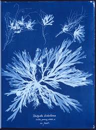
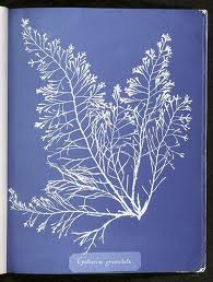
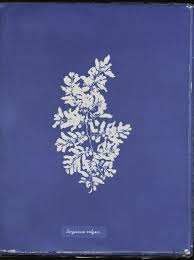
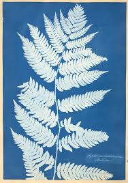
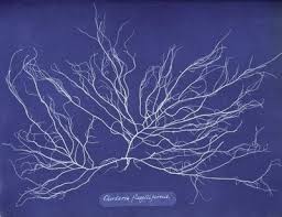
Anna Atkins was a english photographer and botanist. A botanist is a person who specialises in the study of plants. Some of her cyanotype images are displayed on the left. In my opinion, I believe her images are very simple yet effective, as she has just used a plain blue background which makes the outline of the leaves look more developed and sharpened. Also, it looks like she has carefully chosen a specific type of plant which has a thin stem and leaves, which improves the quality of the cyanotype.
|
|
#1 Cyanotype Experiment
|
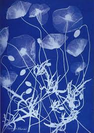
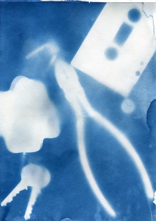
Last week Thursday, we made Cyanotypes outside on the concourse. We exposed the photographic paper to the natural daylight. We laid the paper flat on the bench and put our objects on top. My objects were a set of keys, pencil, cassette tape and pair of earphones. I carefully decided how my composition as I wanted it to be imaginative and once I placed it on the photographic material, we couldn't remove or place it differently as that it was become smudged or the image would not appear. After a few minutes, my picture slowly began to reveal itself and when I removed it, I could vaguely see my objects. We went back to the classroom and washed our cyanotypes under water and then we could see our Cyanotypes in detail. It turned a greenish, yellow colour but then it went a dark blue colour after it was washed. |
My #1 Cyanotype Evaluation
My first attempt of the Cyanotypes came out blurry as I mistakenly moved some objects about shortly after placing them. I like the colour of the Cyanotype as it is a light blue colour. I think I should of added more objects. Next time, I won't move the objects to improve my Cyanotypes and make the outlines less blurry as it appears now. I will also use more objects to cover the blue space in my cyanotypes as it looks really plain and empty. Also I will try to apply less water on my cyanotype to avoid any water stains that are currently visible in my cyanotype.
My first attempt of the Cyanotypes came out blurry as I mistakenly moved some objects about shortly after placing them. I like the colour of the Cyanotype as it is a light blue colour. I think I should of added more objects. Next time, I won't move the objects to improve my Cyanotypes and make the outlines less blurry as it appears now. I will also use more objects to cover the blue space in my cyanotypes as it looks really plain and empty. Also I will try to apply less water on my cyanotype to avoid any water stains that are currently visible in my cyanotype.
